- Have any questions?
- USA: +1 (213) 233-1633
- India: +91 8910802928 |
- Email: support@zebratechies.com
3 Points of Design for Better User Experience
Securing better user experience is the key to a website success. More clearly, an online business success is largely dependent how nicer you can guarantee your customer journey. The users stay on and use your site, the better. It means your site is able to encourage, engage and effect the buyer personas the way it wants.
And all these can happen only when your site acts, interacts and moves in tune with users’ preferences. In few words, improved user experience and increased user engagement are the keys to all these important results.
First of all, user experience is the thing that begins with how well interactive and understanding your site is and how well your site interests its users and what your users like about it. To interpolate how user experience could be, you make a recce across your site first and it is sure you can then figure out what keeps you engaged on your site.
Use Contrast to Draw Attention: Look at any site. You could find out many an elements that are just for user interaction. Buttons, hyperlinks, input fields, sidebar widgets, and the list is just long in number. Many of them are perfect for visitors and designed with higher contrast to stand out from other elements on the page.
High color contrast and visual pattern are important to make a site page standout. Note that anything that stands out from its surroundings whether by size, color, shape or white space, that can appear more important on the basis of context. So, use contrast to draw attention towards certain page elements that can egg on and engage visitors into your desired task. For instance, they could be more newsletter signups, eBooks downloads, A/B case studies, etc.
Tasteful UX/UI Animation: Multiple varieties of animations can suggest certain behaviors. For instance, while hovering over a button it might bounce up to show that it is clickable. Error messages may also often tend to shake to draw attention from the user. While focusing on animation, one thing has to be on consideration that it shouldn’t be wild and symmetrical to the site ambience. Animations are more suitable for TVs and movies rather than interfaces.
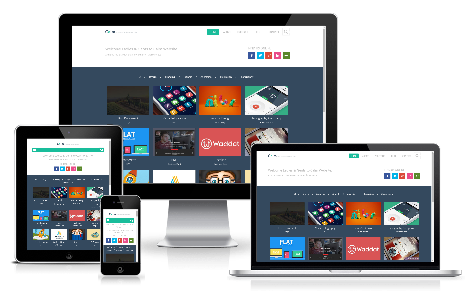
Responsive Design as a Requirement: Every site has to be multi-channels friendly. Social media users are often seen accessing their accounts on their smartphones and tables. So, it’s quite natural that sites being promoted across them would also be accessed on those platforms. Having said that it is meant that your site has to be all screen-wise and all critical features should be designed in a whole new light. So, while planning for a site, get off on a right responsive design strategy.
All these in one site can simplify interaction process and when it is, it would guarantee the quickest user experience, implied by the design. However, it’s quite impossible to hold out a set of design parameters as the best, capable to enhance usability.

By Professional qualification a Computer Engineer, By Profession an Online Marketing Strategist and Web Application Development Expert, By Industry position working as a CEO at Zebra Techies Solution!
WARNING! ONLINE JOB FRAUD ALERT!
We do not offer work-from-home, part-time, or online jobs. Job seekers, beware of job scam calls and WhatsApp, Telegram messages, Instgram Groups or TikTok ads! We have not authorized any agency or person to recruit on our behalf. We never ask anyone to provide online reviews, video views, likes, comments, Instagram group joining or follower gains in exchange for money for us or our clients. We only communicate via our official email address and conduct physical interviews at our registered Kolkata office. If you receive such fraudulent messages, calls, or ads, please report them to your nearest POLICE STATION instead of reaching out to us. Stay alert and be safe.

